
Goodreads Mobile App Redesign
My Role: Research, UI/UX, Prototyping
Tools: Adobe XD, Adobe Illustrator
Timeline: January 2023 - April 2023

Background
Goodreads is the best one-stop shop for anyone looking to track reading progress, book recommendations, and an interactive reading community. Goodreads is a tool that can be used to tack the books you are reading, ones you want to read, learn about new books you would be interested in, participate in reading challenges, and more!
The Process
Research
In the initial stages of research, there were many things that I did to gain insight into how to make the current Goodreads app even better.
Observed reviews of the current app to see user preferences, feedback, and recommendations
Downloaded and used the current app to get to know the app from a first-hand point of view (see screenshots below of current app design).
Conducted competitive analysis of three competitor apps: Anobii, Storygraph, and LibraryThing
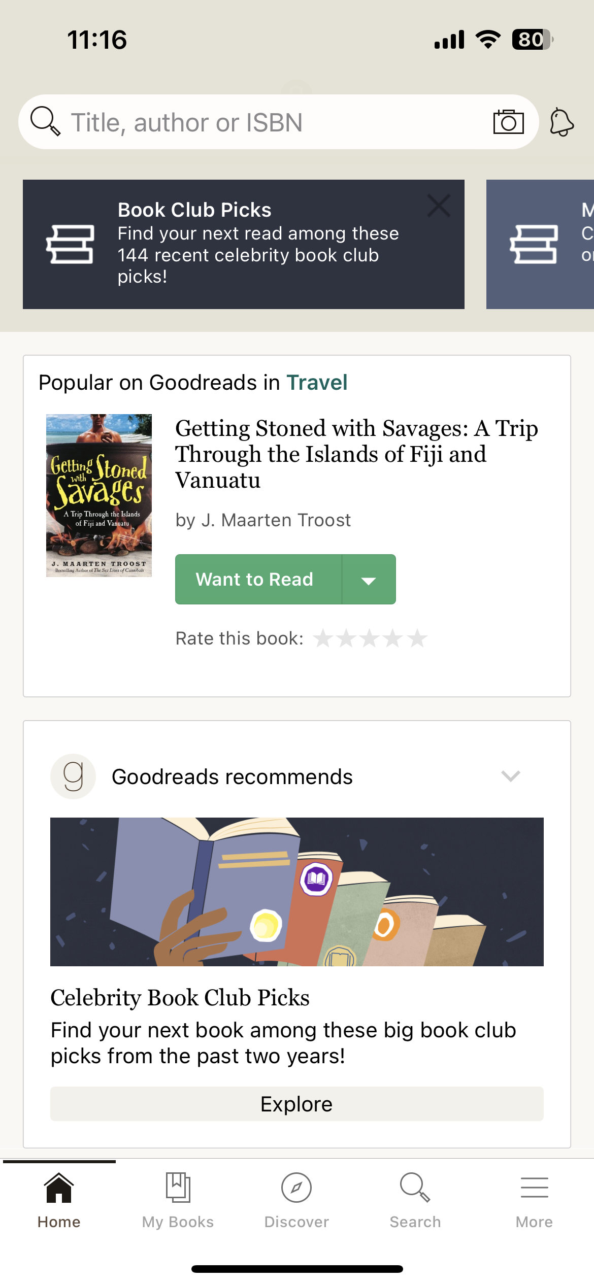
Current "Home" page
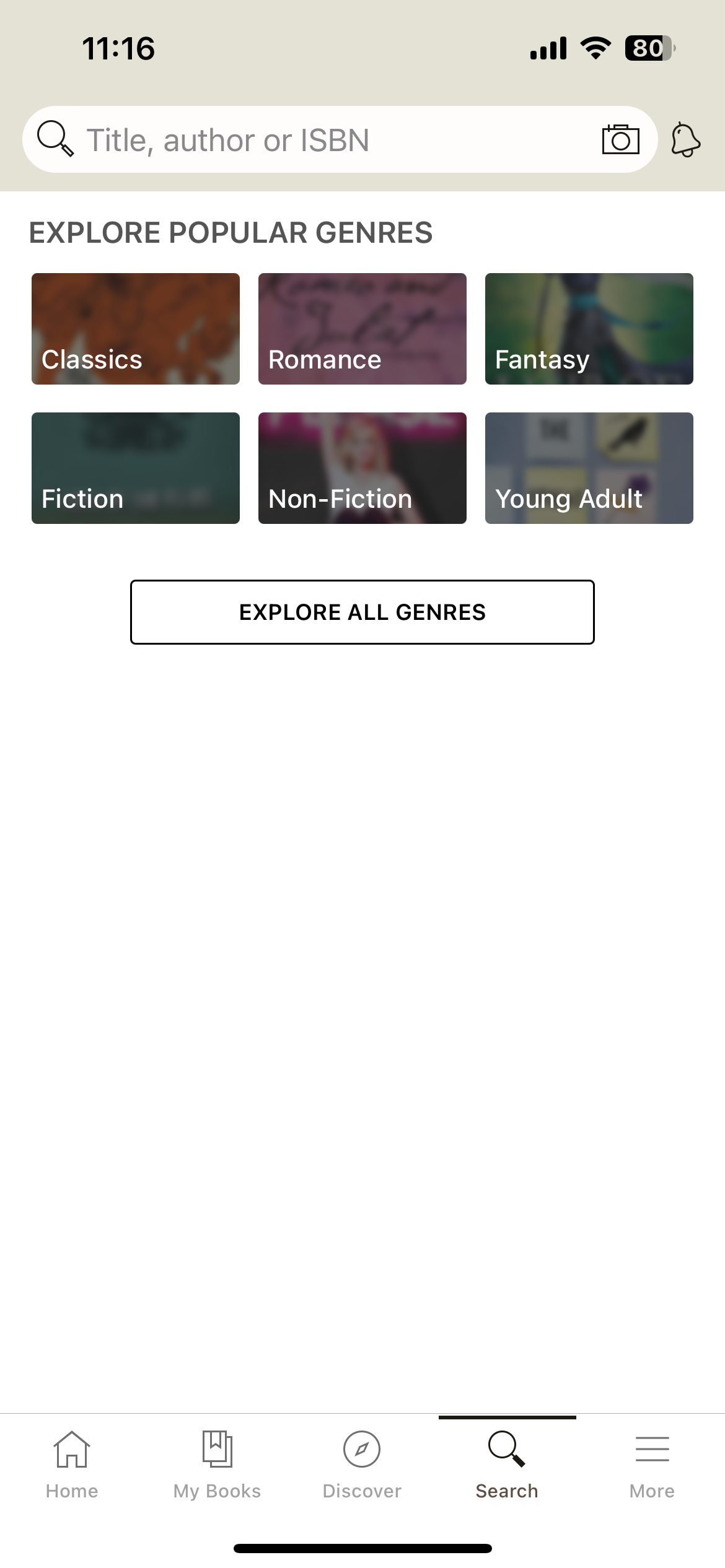
Current "Search" page
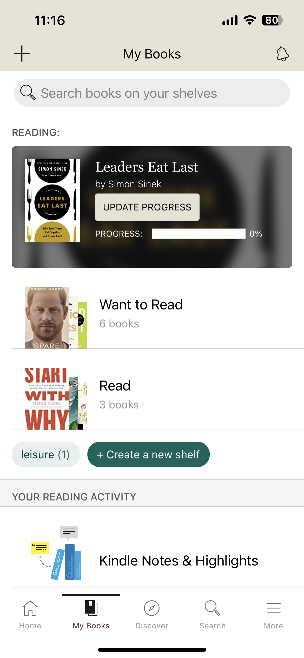
Current "My Books" page
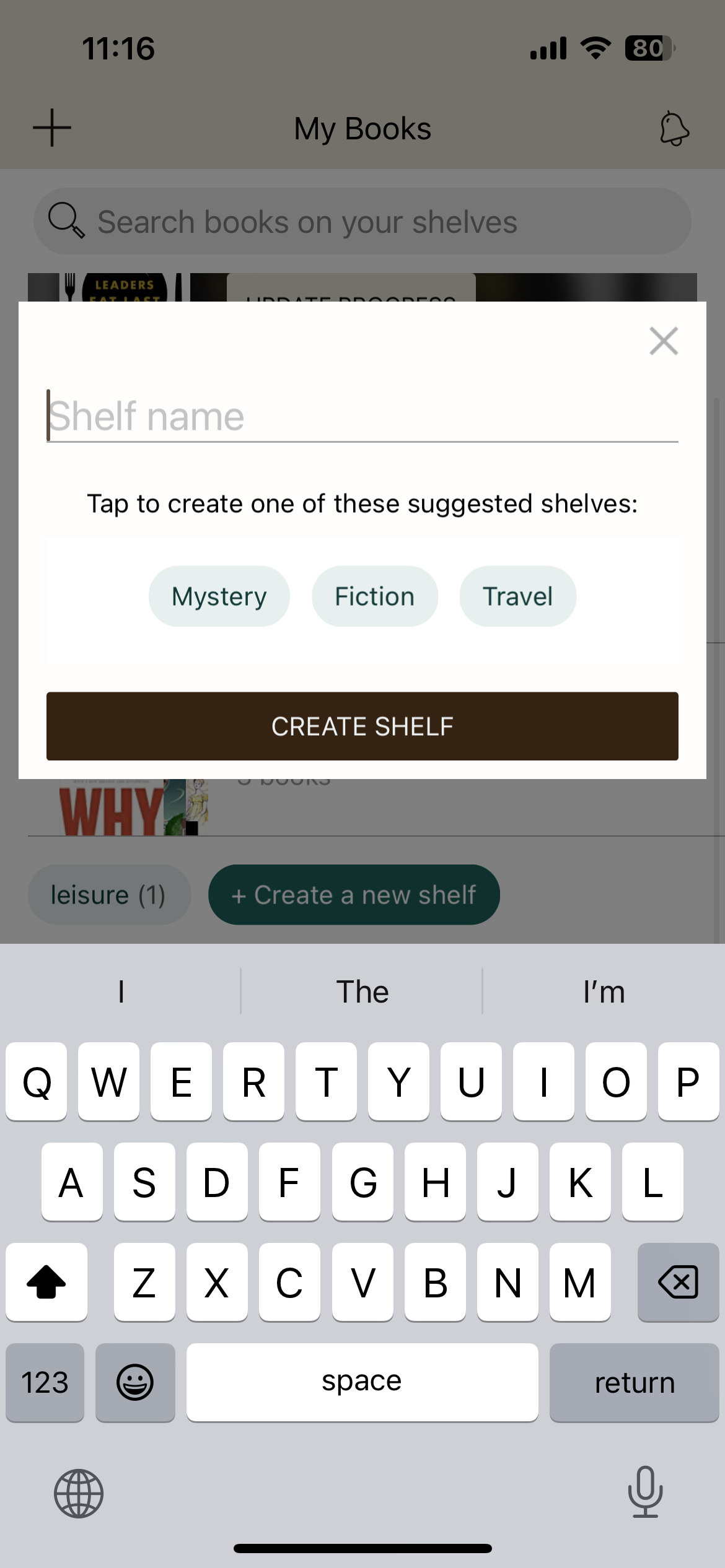
Current create bookshelf popup
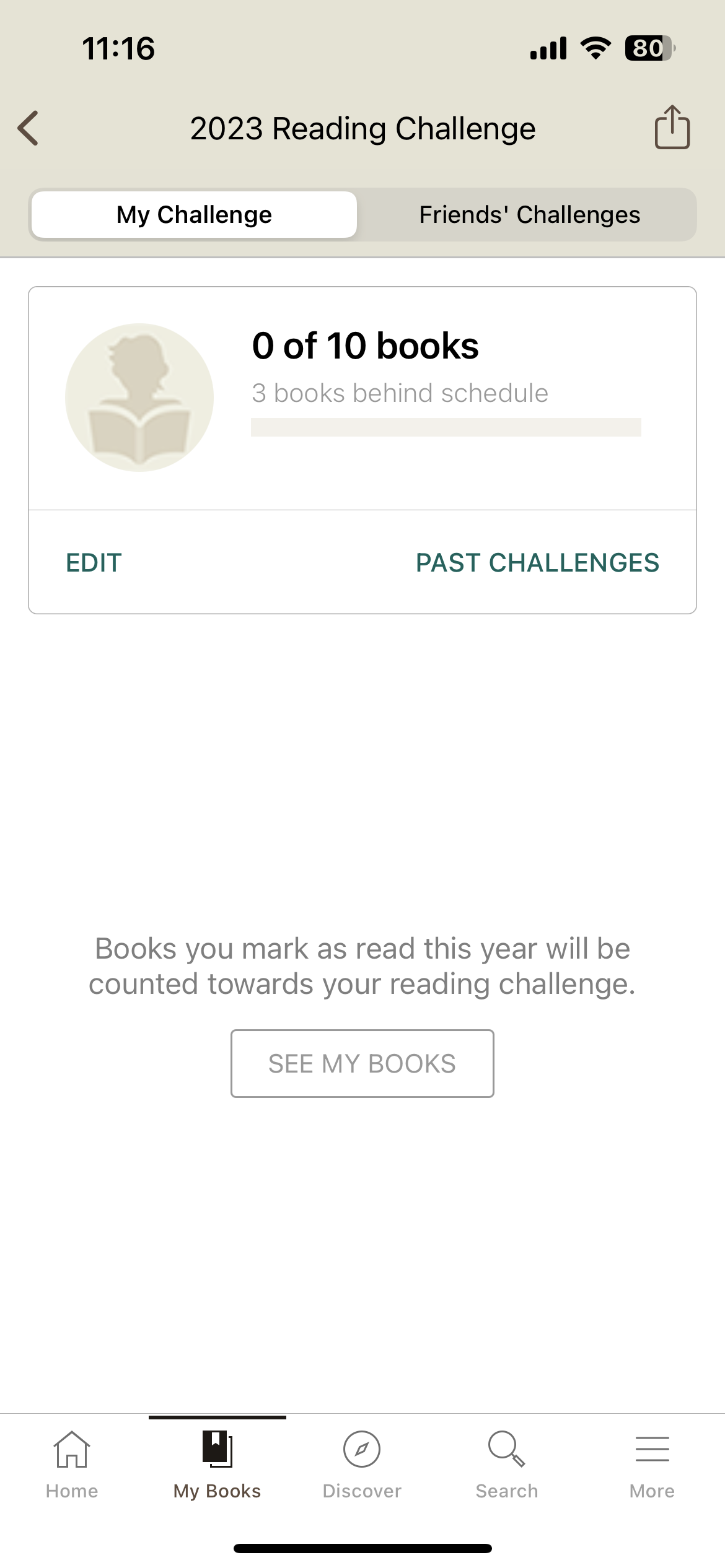
Current "Reading Challenge" page
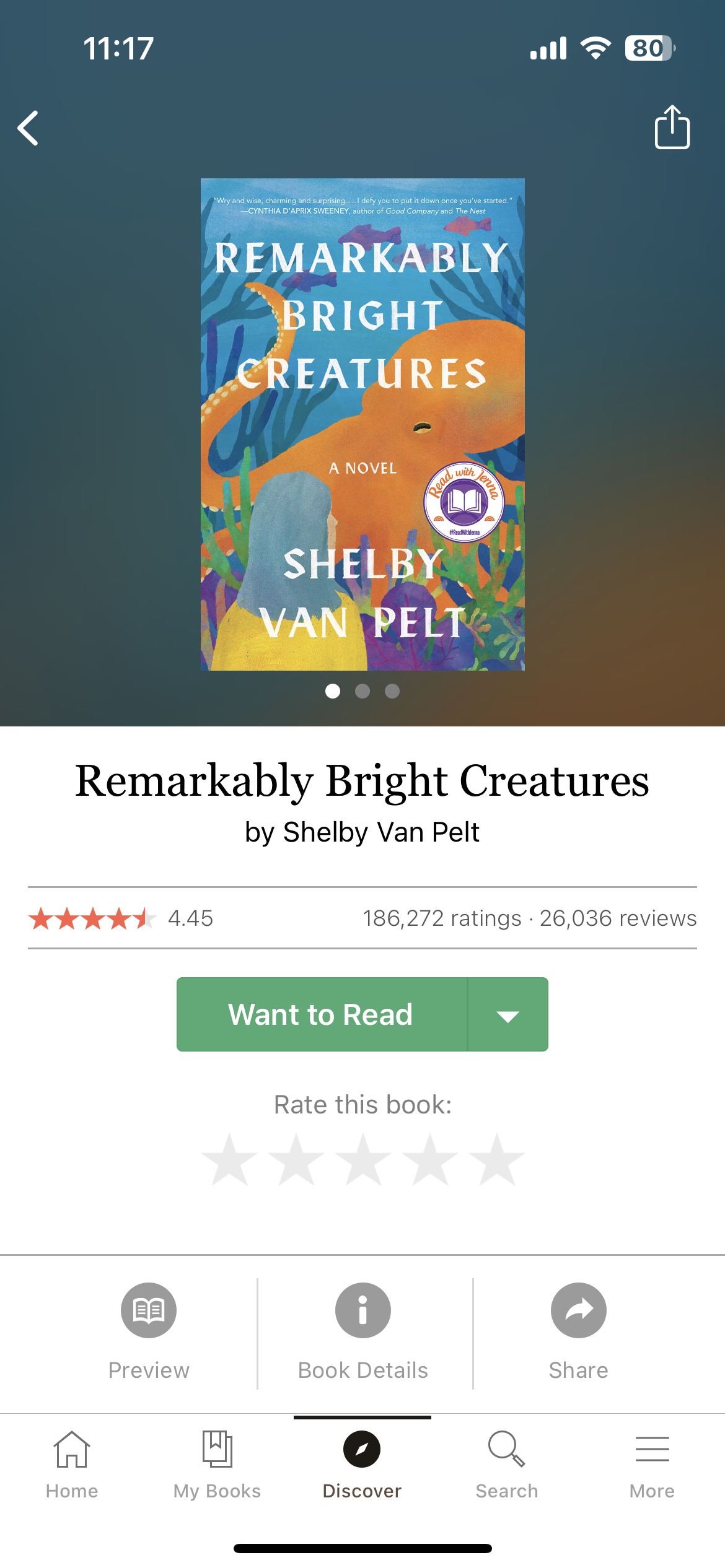
Current book profile
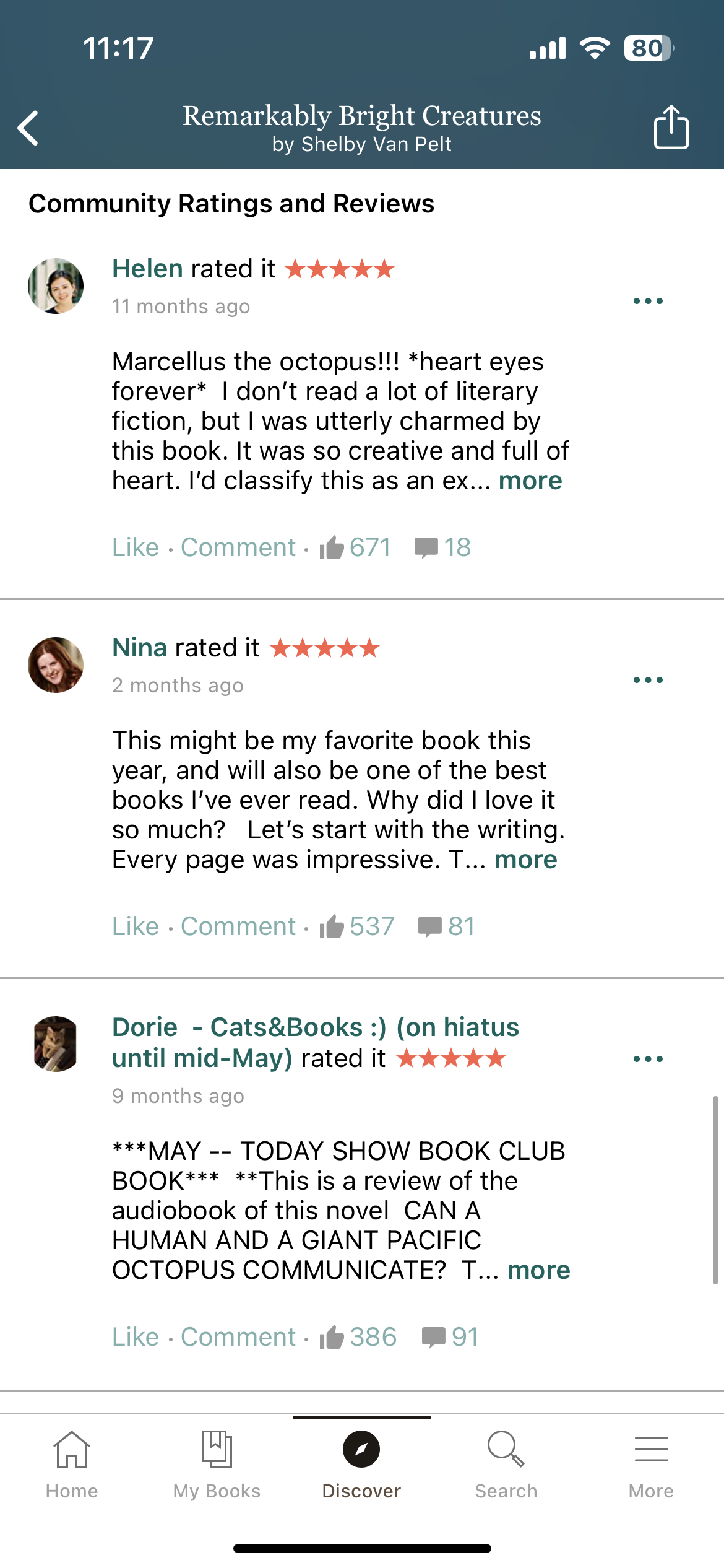
Current book reviews
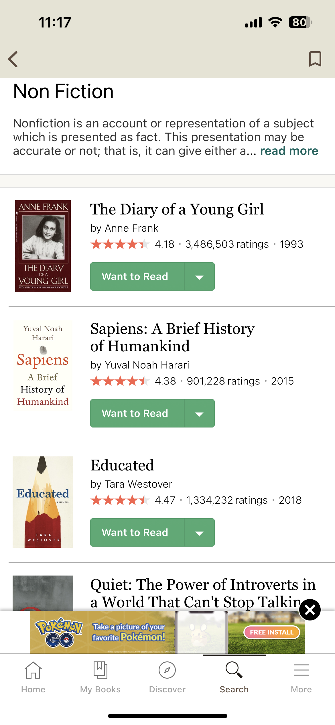
Current "Search" page
Information Architecture
Through information architecture (IA), I distinguished the flow and layout of the current Goodreads app. Additionally, I rearranged the IA to disregard repeated parts of the flow, and to put each page in a section that made more sense than its current layout. Among other changes, I consolidated the discover and search tabs, as well as added a community tab to give a home to connecting with friends and authors within the app.

Original IA

Rearranged IA
Success Metrics
Success metrics were distinguished to keep the user flows and research in line. They also were noted as ways of measuring success for the final prototype.
Usability – ease of moving around
Increase in usage of popular features on mobile
How long it takes someone to get from point a to point b (find where to write a review, write it, and post it) comparing the current app to the new design
Number of book reviews in one month now vs. redesign
New total user profiles created once updated
User Flows
I also came up with points that users would be able to accomplish with the the app redesign. These then translated into user flows.
Track personal reading progress and meet goals
Write book reviews and rate books
Interact with friends, authors, and community through a community
Find more books to read based on personalized recommendations
Add books to bookshelvesUser flows were a major part of the app redesign. After redesigning the IA, I decided on the five most important user flows for the app.
When creating User Flows for Goodreads, I had to think about the starting and ending points and potential actions that a user would need to accomplish in order to complete the designated goal. From there, I had to lay it out visually in a way that was most intuitive.

User Flow: Discover new books to read based on personalized recommendations in discover tabs

User Flow: Track current reading progress based on how much of a book you've completed
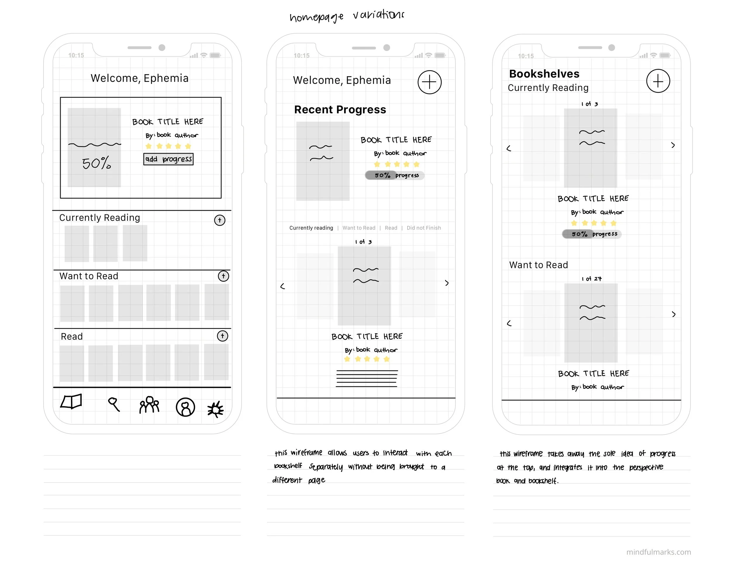
Wireframing
The wireframing process began with very simple sketches that evolved through each week of feedback. Spending weeks on the wireframe process was necessary, through user testing and refining, to ensure that they were the best quality and most intuitive to navigate.
Below are my original wireframes (scattered, unclear, no vision) versus my redesigned wireframes (refined, consistent).
Original draft wireframe

Original draft wireframe

User Flow 1: Follow a friend or author

User Flow 2: Add book to bookshelf

User Flow 2: Add book to bookshelf

User Flow 3: Discover new books to read

User Flow 3: Discover new books to read

User Flow 4: Write a review

User Flow 4: Write a review

User Flow 5: Track current reading progress

User Flow 5: Track current reading progress

User Flow 6: Sign up for a Goodreads account
User Testing
In order to establish the effectiveness of my user flows, I conducted two rounds of user testing on two of the flows. This allowed us to show our wireframes to potential users and look at the flow and thought process that occurred when they used the app.
App Branding
The goal with this app rebrand was to keep the new branding simple, and to give the app a facelift. To do this, I decided to redesign the logo with a simple, professional, modern, and chic typeface Dermagent.
I stuck with the original light browns and dark browns to reflect a vintage vibe, as well as to stay true to the color of home bookshelves and to give the app a natural feel. To add a pop of color, I added a contrasting dark purple color into the mix for actions such as buttons.

Goodreads brand identity board

Design
After finalizing the design of each of the wireframes as well as the UI kit, it was time to translate sketches into design elements.
Using the pre-created basic components, I designed each app page for the steps of the user flow. This included creating interactive elements such as scrolling features.
The design element of the process truly allowed me to implement all of my design thinking up to this point. It also showed potential failures in design and what may not translate well into the true design of the app. Through trial and error, user testing, and redesigning, I finally arrived at the final app design. See photos of some screens below.

New Home Page

Community Page
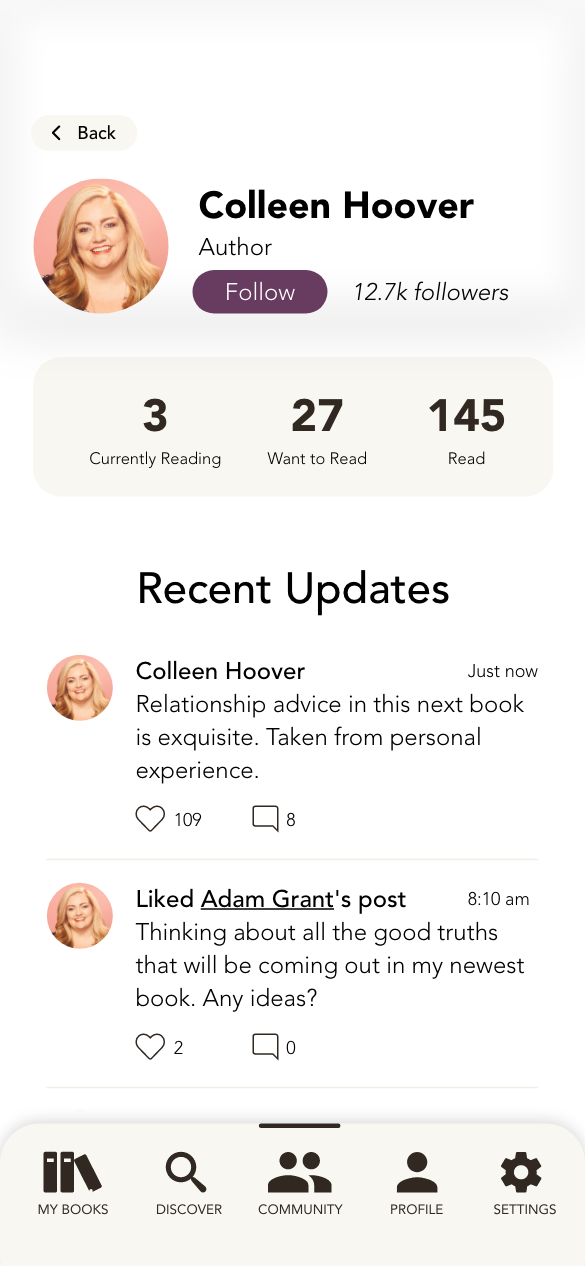
Profile Page

Search Page
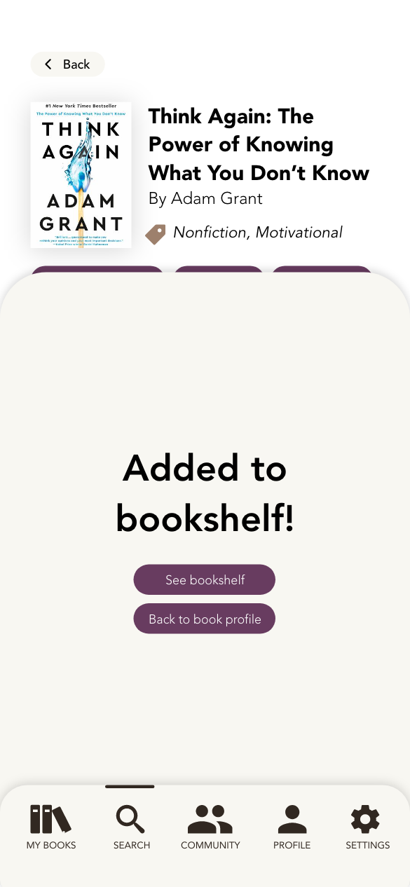
Add Book to Bookshelf

Book Profile

Update Reading Progress
Prototyping
When the design was finalized, it came time to prototyping and tweaking. Using the component states that I had previously created in the UI kit, I was able to easily prototype actions on each page and transition from one page to another based on the action by the user.
Through a process of testing on an iPhone 13 Pro using the Adobe XD app, I was able to make tweaks and prototype improvements until arriving at the final result. See videos below for three user flows fully designed and prototyped.
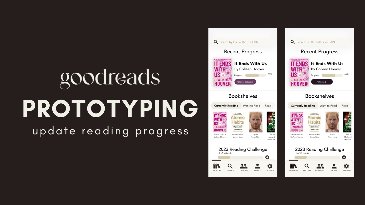
Video of Goodreads app prototyping: update reading progress.
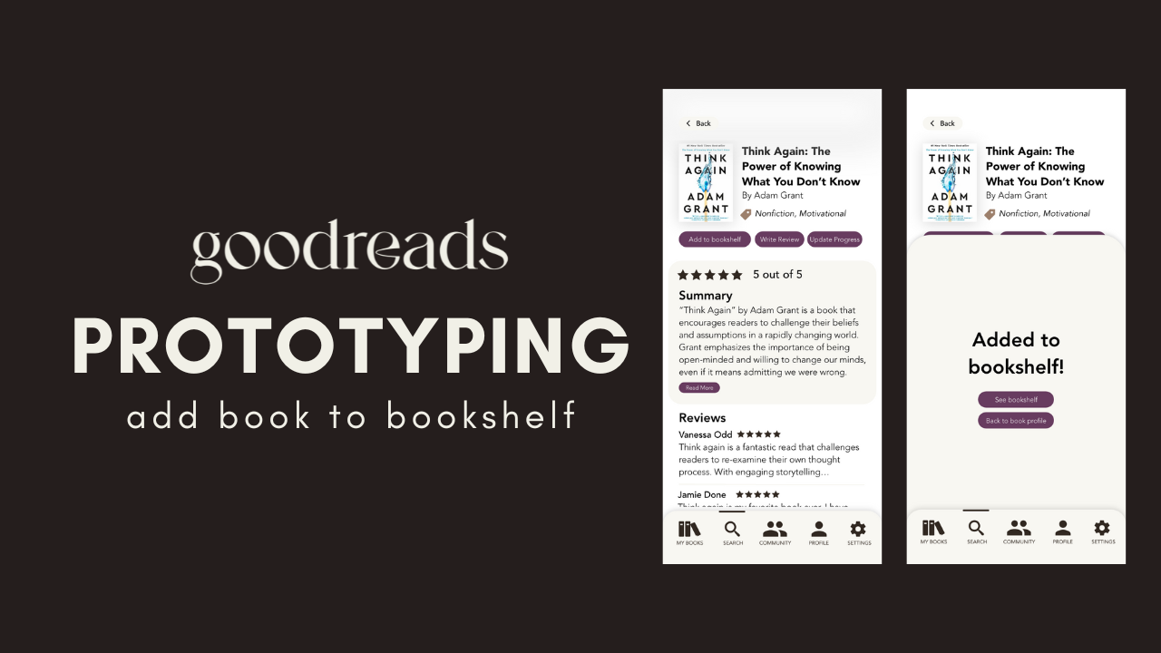
Video of Goodreads app prototyping: add book to bookshelf.

Video of Goodreads app prototyping: follow an author.
Conclusion
This was the first mobile app design project that I worked on. These are three key things I learned:
Detailed research is imperative and, while it may be time consuming in the beginning, it saves time from making mistakes at the end of the project.
User testing is key to the success of app design. You cannot understand how a user will interact with a particular feature until you watch them do so.
Be cognizant of device-specific features such as the notch and swipe up bar on iPhones.

Image by pikisuperstar on Freepik

Image by rawpixel.com on Freepik