Museum Event Poster & Card Design
My Role: Layout, Type Research
Tools: Adobe Illustrator, Adobe InDesign
Timeline: February 2021 - March 2021
Background
The Problem
In an effort to draw in more, a museum needed help marketing and promoting their exhibition with legendary artist, Barbara Kruger. The goal of this project was to create a visually appealing and informative museum poster and card design for the upcoming art exhibit titled "The Modern Master Series". The exhibit was targeted towards art enthusiasts and the general public.
Key Question
How can we design a poster and card in a way that captures the essence of the exhibit while providing all essential information in a clear and concise manner?
Initial card and poster sketches.The Process
Research
Sifting through the history of Barbara Kruger’s past works really helped me understand her rigid style and nontraditional ways of combining stylistic photos with sharp shapes. Through my initial research, it quickly became clear that the most important information to showcase would be Kruger’s art as it would speak for itself.
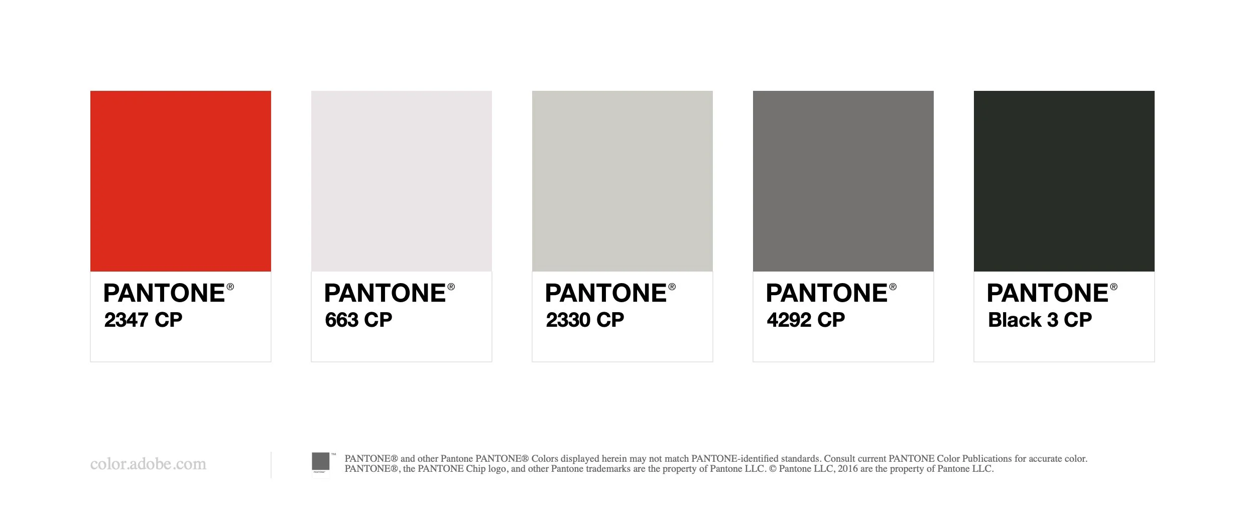
I stuck with Kruger's staple color scheme — her bold red against the contrast of black and white allowed for sharp visuals that would be hard to miss in any scope.
I began with three comps for both the poster and card, all including the necessary information about the artist and the event. After observing what worked visually and what did not, I landed on my first comp of one of Kruger’s famous pieces with words across the eyes of the individual in the photo. This one was able to best present all of the event information in an artistic way while also being simple and easy to read.
With the museum card, I was able to implement the same stylistic choices, vouching for the art to speak for itself and draw the users in with their interest in her work. The finals that came to fruition met the goals of showcasing both the artist and the event communally while also not having any disconnect between the two.

Poster Comp 1

Poster Comp 2

Poster Comp 3

Poster Comp 4

Card Comp 1 (Front)

Card Comp 1 (Back)

Card Comp 2 (Front)

Card Comp 2 (Back)

Card Comp 3 (Front)

Card Comp 3 (Back)
Impact
The designs were able to playfully portray the idea of the exhibit in a stylistic and intriguing way. The success of this project will be measured by the ability of the poster and card design to effectively communicate essential information about the exhibit while engaging and inspiring the target audience.
If I were to do this project over, I would consider a few things:
Try some sketches that don’t include the art from Kruger in them.
Use a different color scheme that compliments Kruger’s work.
Incorporate a more modern or abstract poster design with more colors.

Final event poster

Final event card (front)

Final event card (back)
Mockup by berlionemore_contributor on Freepik


